
Running Club Logo Ideas: What Works on Real Kit
Running club logo ideas that survive real use: what works on a singlet, a 40 pixel avatar, and a one color print, plus the mistakes that cost you money.
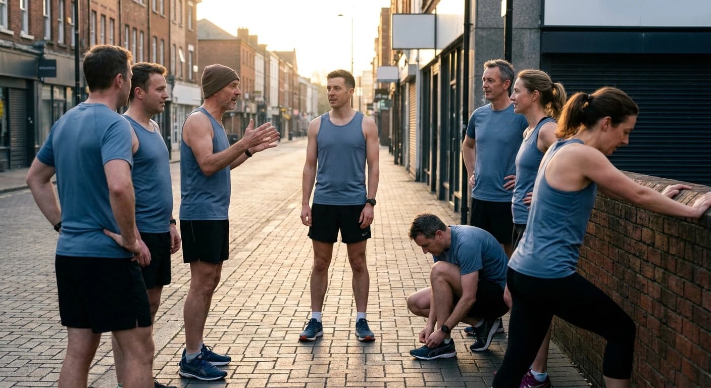
A running club logo works when it stays readable at one inch on a singlet and at 40 pixels as a profile picture, survives being printed in a single color, and does not lock your club into one neighborhood or one distance. Almost every logo that fails a club fails for one of those four reasons, not because it looked bad on the laptop it was designed on.
That is the whole trick, and it is why this is an operations decision rather than an art project. Your logo is not going to be admired at full size on a screen. It is going to be squinted at from thirty feet away in a race photo, embroidered onto a hat by a machine that cannot render a thin line, and shrunk into a circle next to your club name in someone's phone. Design for those, and the rest takes care of itself. This is one of the earlier decisions in starting a running club, and it is one of the few that gets expensive to undo.
Where does a club logo actually get used?
Before picking a direction, write down every place the mark has to live. For most clubs the list is short and unforgiving:
- Singlets, tees, and hoodies. Screen printing and embroidery both hate fine detail. Embroidery in particular cannot hold thin strokes or small text, and every extra ink color costs money per shirt.
- A profile picture. Circular, tiny, viewed on a phone. Anything with more than one idea in it turns into a smudge.
- Race photos and group shots. The mark is seen in motion, at distance, folded across a moving chest. Contrast matters more than cleverness.
- Stickers, water bottles, and hats. Small surfaces, often one color.
- Flyers, banners, and event posts. The one place you get full size and full color, and the one place people over-optimize for.
Notice that four of those five are small, moving, or monochrome. Design for the profile picture and the singlet, then check that it still looks good on the banner. Doing it the other way around is how clubs end up with a beautiful crest nobody can identify from across a parking lot.
What makes a running club logo actually work?
Five properties, in order of how much trouble they save you:
It reads in one color. Build the one-color version first, then add color. If the mark only makes sense in three colors with a gradient, you will pay for it on every print run and it will disappear on a dark shirt.
It survives at small sizes. Print it at one inch on paper and look at it from arm's length. If any element vanishes or muddles, cut that element. This single test kills most bad logos in about a minute.
It has more than one lockup. You want a horizontal version for banners and email, a stacked version for shirt fronts, and an icon-only version for the profile picture and the hat. Same mark, three arrangements. Ask for all three up front, because coming back for them later usually means paying twice.
It carries the name, or pairs with it. Pure symbols only work for brands with budgets. A club is better served by a strong wordmark, or an icon that always travels with the club name next to it.
It does not paint you into a corner. Two traps here. Putting a specific distance in the mark ("5K Crew") ages badly the day you add a long run. Building the whole identity around one landmark or one meeting spot gets awkward when the club adds a second location across town. Local flavor is good. Local handcuffs are not.
What running club logo ideas actually hold up?
Six directions that reliably survive contact with kit, ranked roughly by how forgiving they are:
- A wordmark. Your club name set in a strong typeface, tightened up, maybe with one small twist like a letter that suggests movement. Cheapest to make, most legible, scales everywhere, and it does the SEO-adjacent job of making people remember what you are called. Underrated because it feels too simple.
- A monogram. The club initials locked into a circle, shield, or plain block. Excellent for hats and small embroidery, and it gives you an icon-only lockup for free.
- A local silhouette. A bridge, water tower, skyline, ridge line, or lighthouse. Instant recognition inside your city, strong sense of place. Keep it to a single simplified shape, and skip it if the club plans to expand past that neighborhood.
- A route line. A single continuous line that traces a signature loop or an abstract path. Distinctive and specific to your club. The risk is detail: a real GPS trace turns to spaghetti at small sizes, so simplify it to a handful of curves.
- A simple runner or footprint. Universal and instantly readable. Also the most generic option in the sport, so it needs one specific twist to avoid looking like clip art.
- An object with club personality. A coffee cup, a donut, a dog, a local bird. This works beautifully for social-first clubs and communicates culture faster than any tagline. It works badly if the club sees itself as competitive, so match it to who you actually are.
Pick one. The most common mistake is trying to combine three of these into one crest.
What should you avoid?
- Thin strokes, gradients, and drop shadows. They look fine on screen and fail in print, embroidery, and at small sizes.
- Text inside the icon. Slogans, founding years, and city names crammed into the mark disappear first. Keep supporting text as a separate lockup element you can drop when the logo goes small.
- Detail you cannot see at one inch. Individual runners in a pack, shoe treads, tiny sun rays, skyline windows.
- Riffing on a shoe brand's mark. Beyond looking derivative, close imitation of a well-known trademark is a real legal risk on merchandise you sell.
- Too many colors. Every additional screen-print color adds cost per unit. Two colors plus the shirt color is a comfortable ceiling for most clubs.
- Locking the logo to one person. More on that next, because it is the mistake that actually strands clubs.
How do you get one made without spending a fortune?
Most clubs have three realistic paths: a member who designs for a living or as a hobby, a local design student who wants portfolio work, or a freelancer. All three work. What matters more than which one you pick is what you ask for at the end.
Ask for these deliverables in writing before any work starts:
- Vector source files (SVG, AI, or EPS), not just PNGs. Without vectors, every future printer will ask for files you cannot produce.
- A one-color version in black and in white.
- Horizontal, stacked, and icon-only lockups.
- Transparent PNGs at several sizes for web and social.
- Clear ownership. Put it in a short written note: the club owns the artwork and the files outright. This costs nothing at the start and saves a genuinely painful conversation later.
That last one is the operational point. Clubs lose their logo files constantly, not through malice but through turnover. The member who made it moves away, the files were on their laptop, and two years later the club is reverse-engineering its own logo from a JPEG someone screenshotted off Instagram. Put the source files somewhere the club owns, not somewhere a person owns.
How do you test a logo before you print eighty shirts?
Run these five checks. They take about fifteen minutes and they catch nearly everything:
- Print it on paper at one inch wide. Look at it from arm's length.
- Set it as a profile picture on a phone and look at the circle crop.
- Convert it to pure black on white. Does it still read?
- Show it to five members and ask what it is, without telling them first.
- Send it to an embroiderer for a quote. If they come back asking you to simplify it, believe them.
Then order the smallest batch the printer will do before committing to a full kit order. A twelve-shirt test run costs a fraction of a season's inventory and tells you more than any amount of debate in the group chat.
Your logo is a container, not a strategy
A good club logo will not grow your club. It just makes the club easier to recognize, easier to be proud of, and easier to point at when a member wants to bring a friend. Get it legible, get the files, and move on to the parts that actually compound: consistent runs, a roster you can reach, and a club that is easy to find and easy to join.
That is the part RunLink handles. One place for your club page, your roster and member roles, your events and RSVPs, routes, and club chat, instead of a spreadsheet plus three group chats plus a forms link. The iOS app is live and free on the App Store, and you can create or claim your club at runlink.app.